Centre Brand Refresh
We’re excited to share, to better reflect the spirit and character of our Whitsunday’s community, we are refreshing Whitsunday Plaza’s branding.
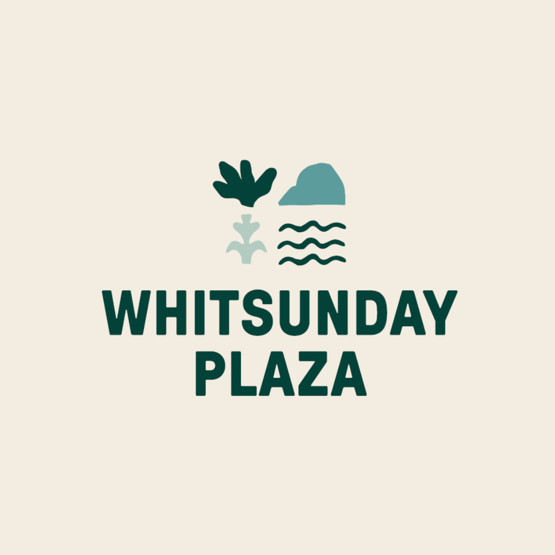
The name “Whitsunday Plaza” will proudly remain, continuing its strong connection to Cannonvale and the wider region. Alongside this, we’re introducing four new logo marques designed to modernise our identity. Each element draws inspiration from the natural beauty and coastal lifestyle that define our home.
Surrounded by lush ranges, tropical greenery, and the sparkling waters of the Coral Sea, Whitsunday Plaza has grown into a vibrant hub for locals and visitors alike. Our centre takes cues from the region’s iconic landscapes, from the reef to the cane fields, to shape our refreshed icons and colour palette.
Our four new icons represent:
- Corals & Botanicals – inspired by the vibrant coral formations and lush tropical plant life that showcase the natural beauty of the Whitsundays coast.
- Mountains – representing the strength and presence of the surrounding ranges, drawing from the distinctive Conway National Park ridgeline.
- Sugar Cane – honouring the region’s long‑standing agricultural heritage and the cane fields that have shaped the Whitsunday’s landscape for generations.
- Waterways – capturing the essence of the Coral Sea and local inlets, celebrating the waterways that connect and define our coastal community.
Thank you for your patience and support as we bring this new chapter of Whitsunday Plaza to life in a staged approach.